Let’s take a look at some of the most famous brands and how their logos have evolved over time.
Share:
All great things have been perfected through trial and error, and logos have an interesting past too. Just as clothing and haircuts go into trend and then go out of style, exactly the same thing happens with logos. Through these changes we can see design trends and the evolution of technology.
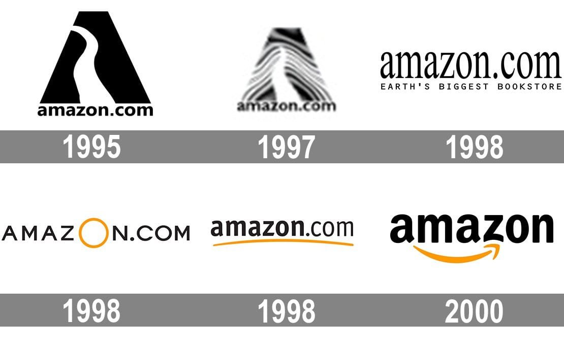
Amazon
Initially, Amazon did not have a cohesive design and a general brand identity. But given that they were one of the first e-commerce platforms, this lack of identity was not amazing.
Clearly, the logo of early 1998 with a large “O” did not last long – that same year, Amazon switched to a lowercase word sign with white spaces and pointed orange. And finally, in 2000, the orange underscore turned into an arrow linking A and Z, symbolizing the wide variety of articles available on Amazon, covering you “from A to Z”.
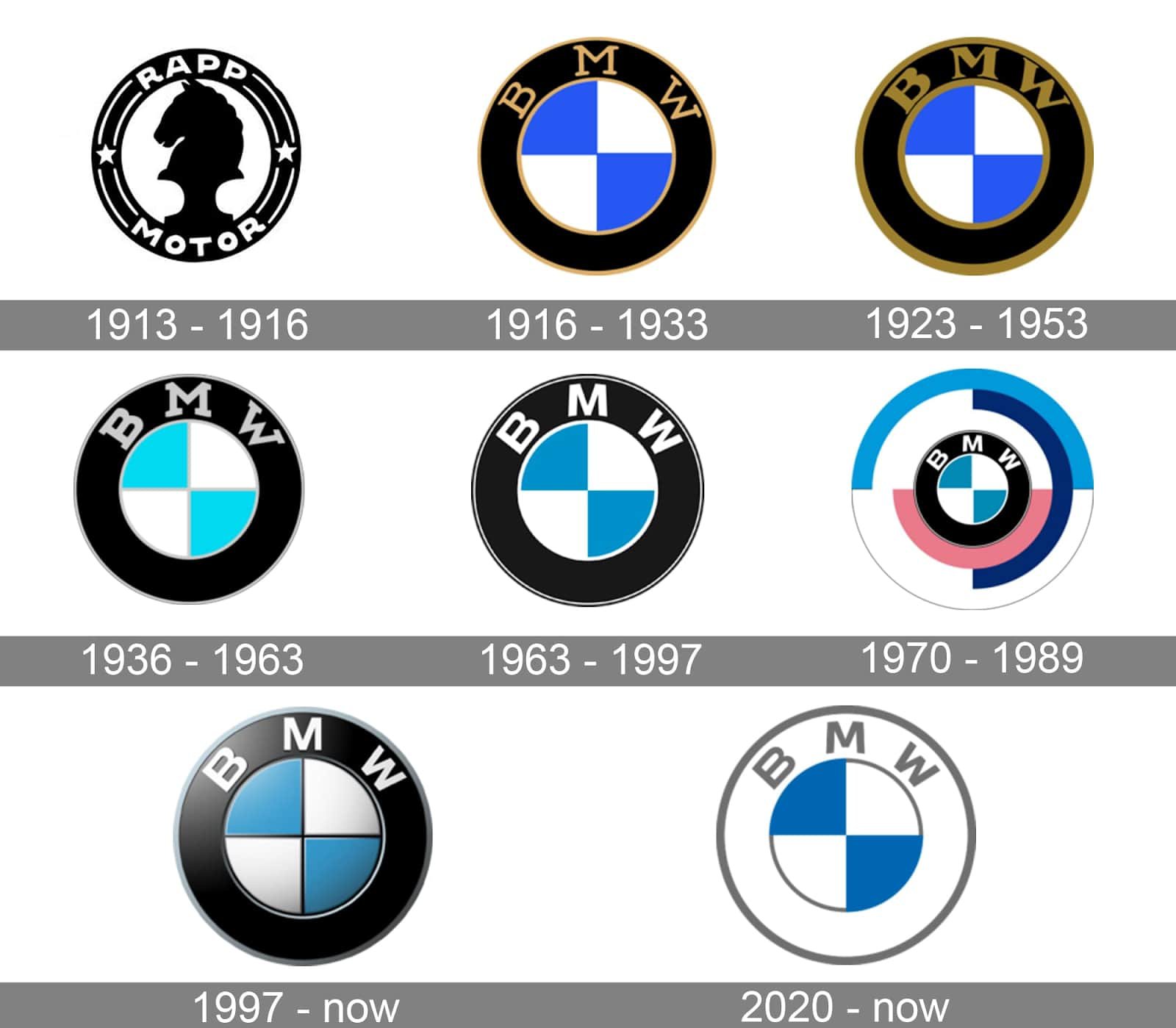
BMW
At first glance, BMW does’t seem to have made many changes to the logo design. We can see that their team is gradually making the design easier – changing the dark gold color to gray and white, creating a visual balance in the process.
From the design from 1997 to 2019, BMW retained the same logo, similar to the design from 1963-1997, but with a 3D element. In 2020, BMW changed dark black to bright and bright white and eliminated 3D.
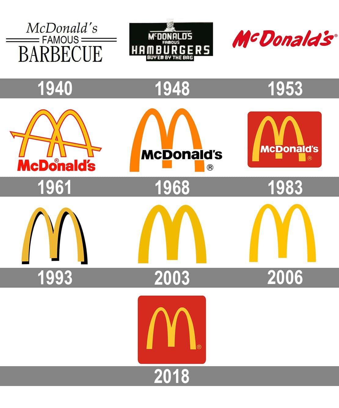
McDonald’s
The company was founded in 1940 and managed by Richard and Maurice McDonald. In 1960 McDonald's sought to highlight its identity - and introduced the golden arches.
It was not until 1968 that they added the name to the arcade to create not only a clearer design, but also to establish a clear brand identity. The 1975 logo design gave us the McDonald’s look we’re familiar with today.
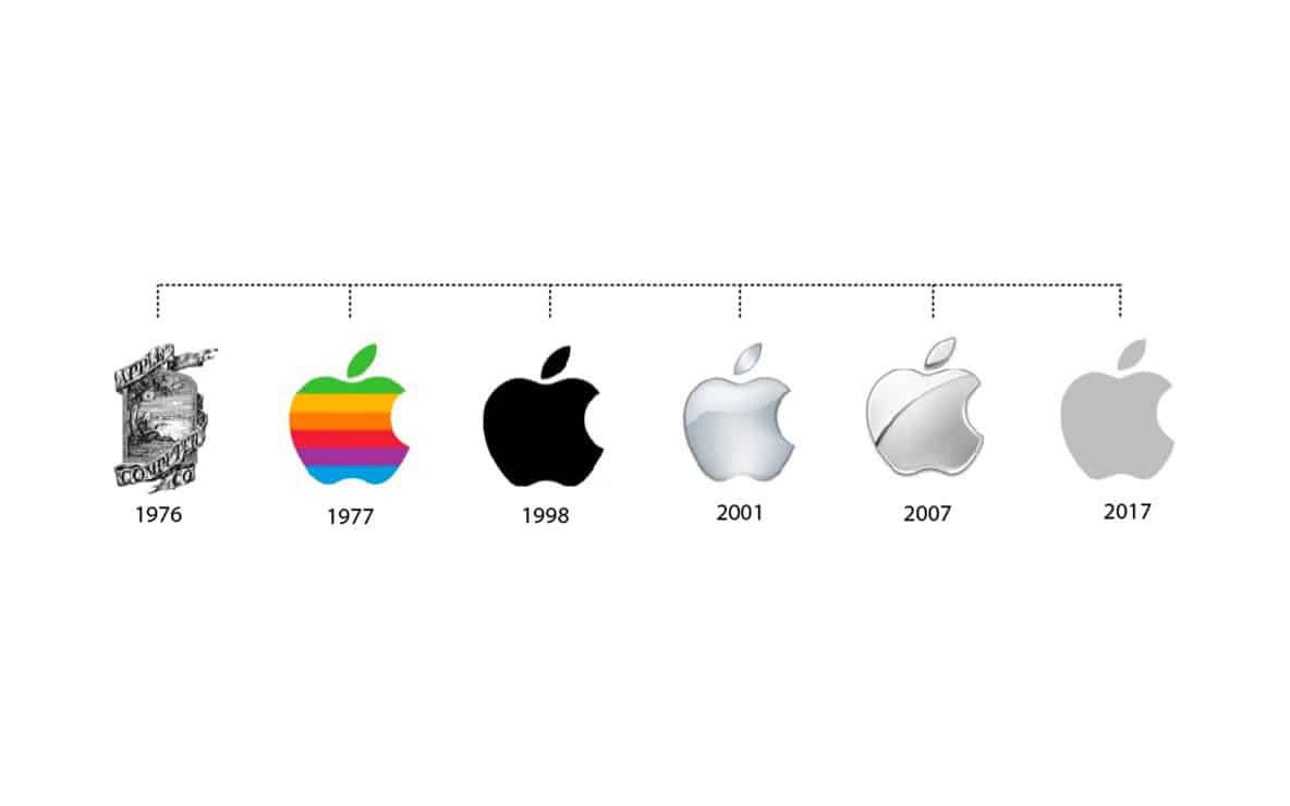
Apple
We all know that the Apple logo is simple, it is also known for incorporating a deeper meaning. This implies that using Apple products, we discover and understand things that would otherwise be unseen. The Apple logo has always been elegant and easy to remember - that is, it brings together all the important elements that it must have.
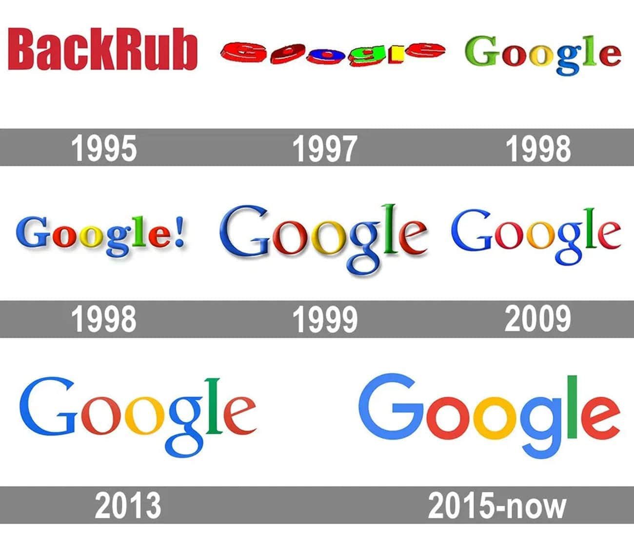
The Google logo has gone through an easy transformation process. And while it hasn't deviated too much in terms of color and placement, its previous iterations are temporary on the internet. For example, the 2015 sans serif iteration aimed to identify the Google brand as friendly, accessible and simple.
The history of the logos of many famous brands is full of interesting and sometimes even funny facts. And the examples of these brands demonstrate once again that the reasons for rebranding are different and vary from company to company.
For example, changing the size of the organization and the philosophy, the need to be trending, how to increase sales and keep up with competitors. But most importantly, these companies have evolved and grown over time.